The Luxembourg Private Equity & Venture Capital Assocation (LPEA) has unveiled a new branding with the aim of better conveying the evolution of the association's constitutency and goals.
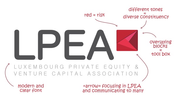
LPEA, founded in 2010, is the representative network of private equity funds managers, investors and service providers in the industry. As from 7 September 2015, the Association will be held under a new, rebranded logo, which has retained the 'LPEA' nomenclature but changed in format to a more straight-forward lettering.
The Association claimed that through the incorporation of red and pink tones, it hoped to better reflect the youth and audacity, as well as the risk-taking attitude, of the network. The different components of the square image containing an arrow are designed to represent the various stakeholders and services involved in LPEA.
The rebranding formed a half year-long project by LPEA's Promotion Committee and Executive Committee, drawing on the expertise of communication agency Mediation.